The visibility of each component on a Salesforce Lightning Page can be controlled, based on multiple variables. In this article, I will explore and explain each of these options with screenshots and demonstrations.
Understanding Salesforce Lightning Page Component Visibility
Salesforce Lightning Page Component Visibility is an essential feature that allows you to conditionally show or hide components on a Lightning Record Page.
When using the Lightning App Builder, you can select a component and set its visibility properties to apply filter logic and conditions to standard components, custom components, and components from the AppExchange.
Dynamic Lightning Pages are a type of Lightning Record Page that allows you to create custom pages with drag-and-drop components. When you add a component to a Dynamic Lightning Page, you can set its visibility properties to determine when it appears on the page.
This feature is useful for creating personalized experiences for different user groups or scenarios and for creating complex, interactive components that respond to user input or system events.
RELATED RESOURCE: How To Customize The Look And Feel of Salesforce
How To Edit Lighting Component Visibility
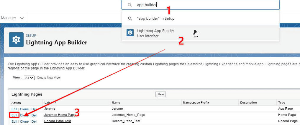
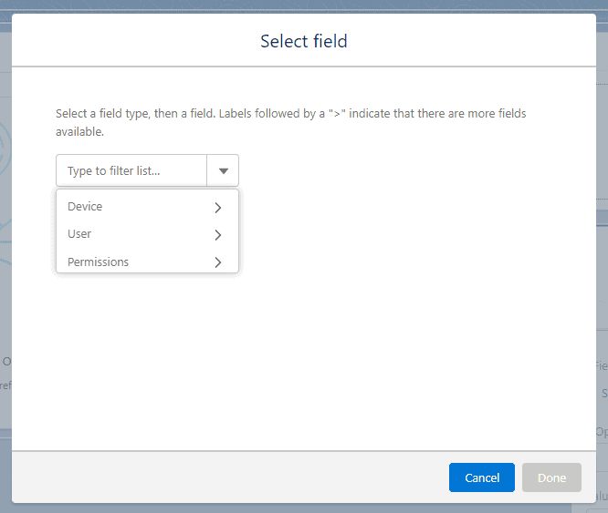
To edit the visibility of a Lightning Component you need to open the page that the lighting component is displayed on, or that you want it displayed on, and open the page for editing in the Lighting App Builder.
To open the lightning app builder, select the gear icon in the top right-hand corner, and enter Salesforce Setup. Type ‘app builder’ into the global search bar, select Lightning App Builder, then choose Edit on the page you want to edit or start a New Page.
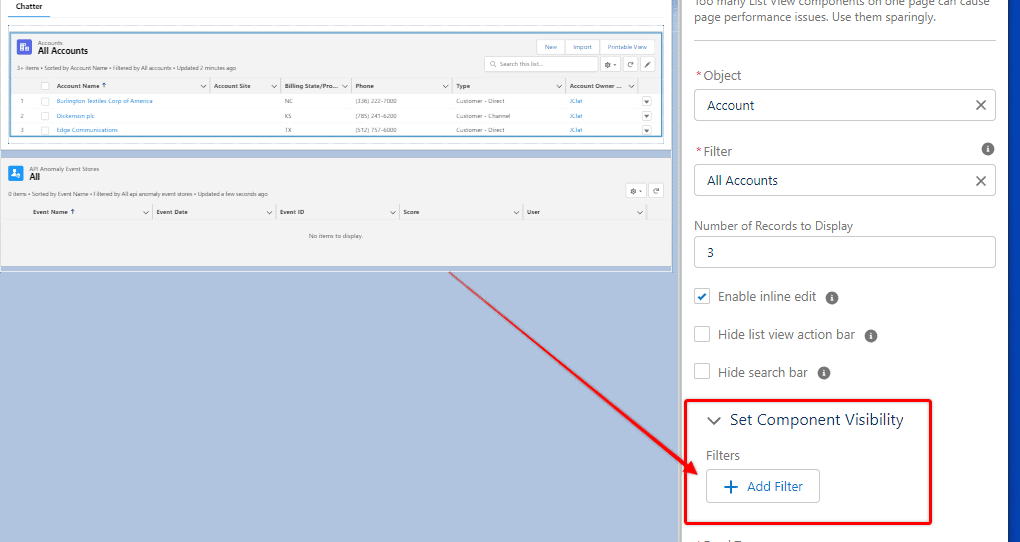
With the desired page open in the Lightning Page Builder, click on a component, and look in the right-hand sidebar for the Set Component Visibility heading. When you choose Add Filter beneath that heading the display options for that page will be visible.
Different Ways To Control Lightning Component Visibility
Before I explain how you can control component visibility, it is important to understand that different visibility controls are available depending on the type of Lightning Page you are working on.
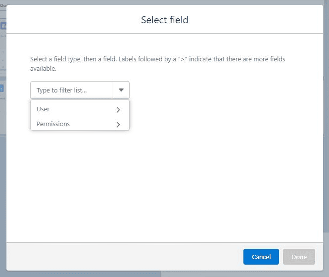
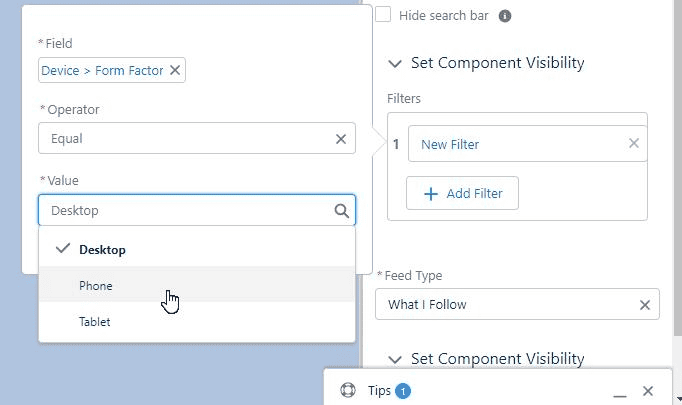
The basic principle underlying adjustments to component visibility is that you identify a particular field (whether it be a field on the user profile or record), permission, or device type – and then dictate visibility based on the value of that variable.
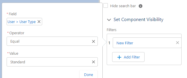
Some potential visibility filters that could be used (just as examples):
- Form Factor EQUALS Phone
- Opportunity Stage NOT EQUAL to Close
- User Type EQUALS Guest
- Permission ‘Create and Customize Reports’ = TRUE
Those are just some limited examples to give you an indication of some of the different ways you could use the visibility filters.
Typically, a Lightning Page Component can be made visible, or not visible based on the device the page is accessed on, user field values, user permissions, and record field values.
But the filtering options available will depend on the type of Lightning Page you are editing.
Adjusting Lightning Component Visibility on a Home Page
Home pages are available for viewing only in Lightning Experience (desktop), not in the Salesforce mobile app. So when you access the filtering options for a Lighting component on a Lightning Home Page the filtering options available to you are based on fields from the user profile and the user’s permissions.
You can use the values in these fields in both a positive and negative way. For example, you can use a particular field value on the User Profile to determine whether a component IS shown, or whether it IS NOT shown, depending on your needs.
Adjusting Lightning Component Visibility on an App Page
App Page filtering options are similar to those of the Home Page, but App Pages are accessible on Desktop Devices and Mobile devices (and Tablets). As a result, there is an extra filtering option called Device.
Using the Device filtering option you can specify whether a component is hidden or displayed, based on the device being used to access the page.
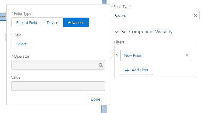
Adjusting Lightning Component Visibility on a Record Page
Lightning Record Pages provide the most versatility when it comes to visibility filtering. In addition to the usual filtering options based on Device, User characteristics, and Permission settings, you can also adjust component visibility based on the values of a field on that record.
Whether you want to show it only when Opportunity Stage is a certain value, or if days since last activity crosses a certain threshold, there are a huge number of ways you could use the component visibility filters.
In my personal experience, I’ve found the user profile and form factor characteristics to be the most useful.
The form factor option allows me to use a single Lightning Page and then customize its look, feel, and function to best suit the device someone is using.
The user profile characteristics are a great way to customize a page based on who is visiting showing components most useful to them, and hiding components that are not useful or suitable for them to see.
Best Practices When Configuring Component Visibility
Test Changes in a Sandbox Environment First
As with all changes to your Salesforce Org, please try out your planned changes in a Sandbox or Dev Org first. Do not make changes directly to your Production environment. You will not only impact users who are currently accessing the system but the changes you make could have some unintended impacts, and it is important not to subject your Production environment to this sort of risk.
Check How The Changes Affect Multiple Different Users
Once you have made changes to a Lightning Page, view that page from multiple different users, with different profiles and permissions to make sure it is displaying as intended for those different users. You might benefit from writing up some test cases regarding how the page should look for certain different users and logging in as each user type, to make sure the changes you made had the intended impact.
Depending on the situation it could be good to involve some actual users in a testing session in your UAT environment to get feedback from them as well.
Send Out Communications If You Make Significant UI Changes
If you have completely transformed a Lighting Page that users access frequently, it would be best practice to consider a communications campaign, and potentially even offer some training opportunities.
Though changing a page layout for a tech-savvy Salesforce Administrator may not seem like a big deal to you, for users who are not so technologically competent, a big change to a page layout can literally be a stressful change. This stress can be lessened by providing adequate communication and offering training opportunities and resources.