There are multiple different Salesforce Dashboard Chart Component types you can utilize in a Salesforce Dashboard to visualize data in different ways.
In this article I’ll cover each component, how they display data, and what they look like.
With many of these chart types, you can layer multiple data points on the X and Y axis to create very informative, but intuitive data representations.
The best way to get to know these chart types is to create a sample dashboard
Table of Contents
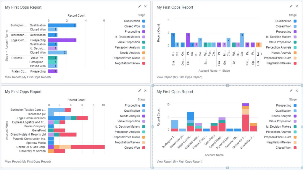
Bar Chart
Bar charts are a type of chart used to display data in a graphical format, where data is represented as bars of varying heights or lengths.
Bar charts are good for comparing data across categories and for showing changes in data over time.
Bat charts can be displayed horizontally or vertically, and can stack multiple data points in a single bar.
RELATED RESOURCE: Data Analysis With Salesforce Dashboards
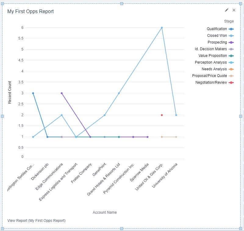
Line Chart
On a line chart, data is represented as a series of points connected by a line. Line charts are good for showing trends in data over time.
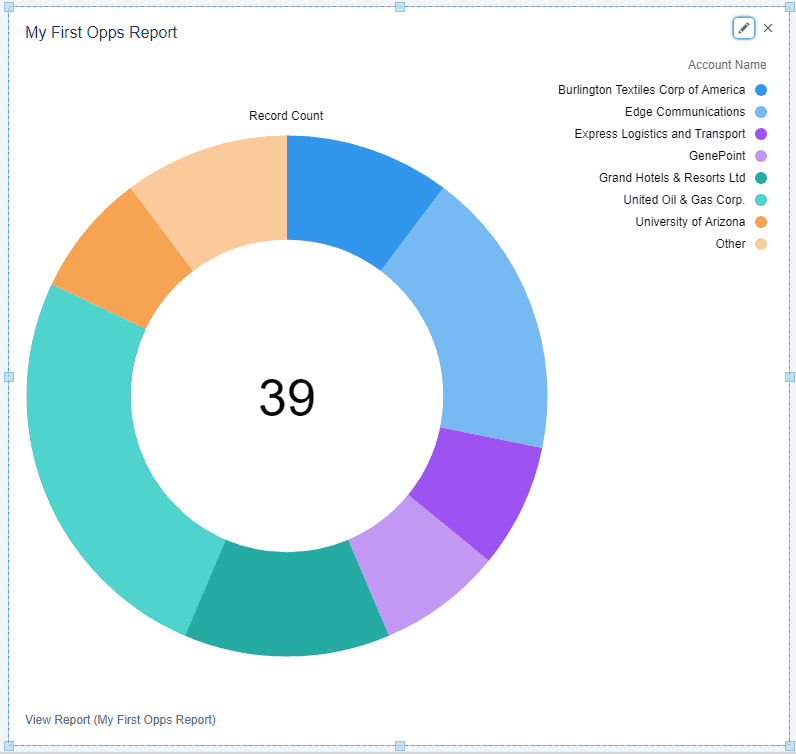
Donut Chart
On a Donut Chart data is represented as a circle (with a hole in it) divided into slices. Each slice represents a category, and the size of the slice represents the proportion of data in that category. Donut charts are good for showing the relative proportions of data in different categories and groups.
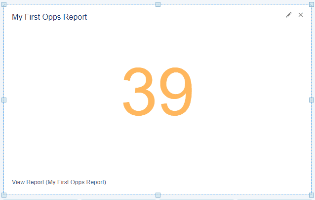
Metric Chart
A metric chart just shows a single numerical value (often a total), and the color of the number can change based on preset numerical ranges.
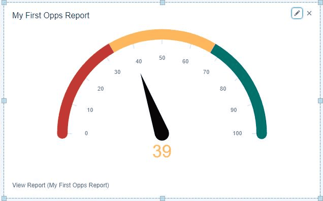
Gauge Chart
A gauge chart is similar to a Metric chart in that it includes a single numerical number, but it situates the number in a graphical scale that you predetermine so that people viewing the chart can get a relative understanding of whether that number is good or not.
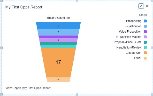
Funnel Chart
In a funnel chart, each stage represents a step in a process, such as a sales pipeline or a marketing funnel. Funnel charts are good for visualizing the progression of data through different stages of a process.
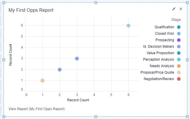
Scatter Chart
On a scatter chart data is represented as a series of points on a two-dimensional plane. Scatter charts are good for showing the relationship between two variables.
It is useful in analyzing correlations, identifying outliers, and comparing data across categories.
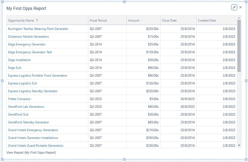
Lightning Table
Lightning tables make it possible to insert a list of records into a Dashboard and see record details. You can filter the records you want to appear and adjust the columns that appear.
I personally find tables a great addition to many dashboards, as they provide an easy way for users to get direct access to the records they might need to work on.