This article will go through the steps required to make a new Dashboard in Salesforce. Salesforce dashboards help to visually represent data in a more meaningful way, which makes it easier to interpret and analyze.
This is especially important for businesses that rely on data to make informed decisions.
By using dashboards, you can quickly identify trends, patterns, and outliers, which can help you gain insights into your business operations.
THINGS YOU WILL NEED
You do not need to be a system administrator in order to create a Dashboard, but you do need to have the ‘Run Reports’ and ‘Create and Customize Dashboards’ permissions.
The reason you need the ‘Run Reports’ permission to create a Dashboard is that Dashboards are visualizations of report data, so if you have no access to reports and report data, then you will have nothing you can display on a Dashboard.
Table of Contents
Creating a Salesforce Dashboard
1. Open the Dashboards App
Open the Dashboards App by selecting the Dashboards from the navigation bar (if visible).
If you don’t see it in the navigation bar, then click on the App Launcher (nine dots on the left-hand side), search for Dashboards, and choose the App link there.
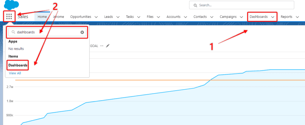
Note: If you cannot find the Dashboards app in either of these ways, then you probably do not have the required permission sets applied to your profile.
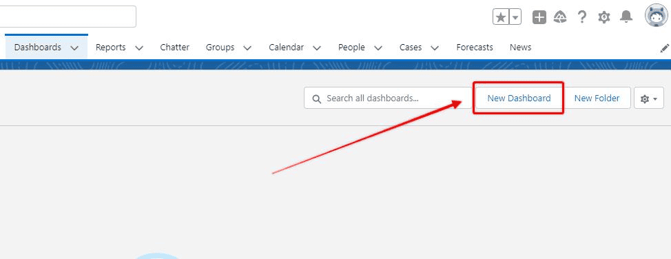
2. Open the Salesforce Dashboard Builder
The Dashboards app opens up with a list of the Dashboards you have already built, or have access to. To create a new Dashboard select New Dashboard.
RELATED RESOURCE: Data Analysis With Salesforce Dashboards
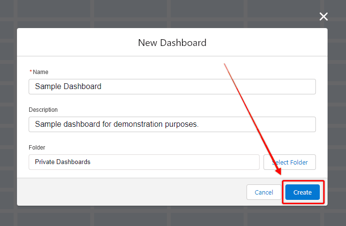
3. Set Up Your Dashboard
Give your Dashboard a name, and description and save it to your private folder. Select Create. Saving Dashboards into other folders, and sharing them with others will be covered later in the article.
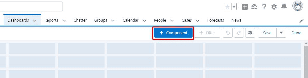
4. Add Components to Your Dashboard
Once you have created your new Dashboard you will be presented with a blank canvas, ready for you to add your Dashboard components.
By default, the Dashboard canvas will be twelve blocks wide, but you can change this to nine blocks if you prefer.
The twelve-block design is typically better because you can configure more elements, and get greater customizability of the size of your Dashboard components.
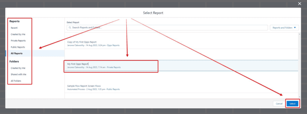
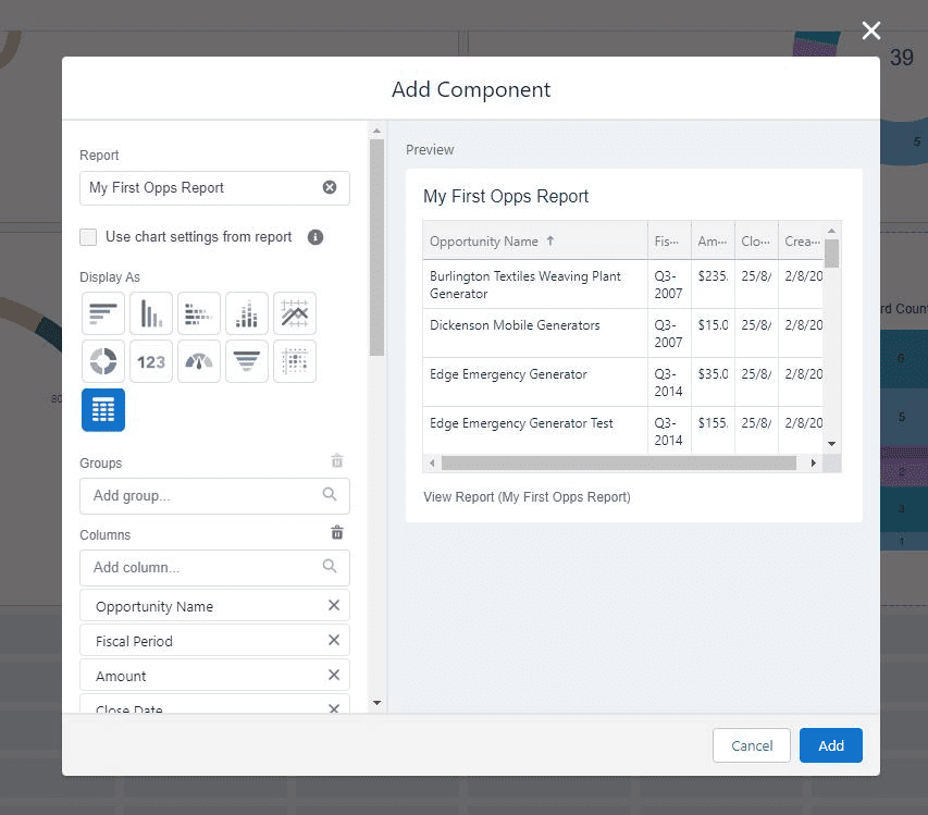
To add a Dashboard component, select + Component. This will prompt you with a list of Reports you have access to.
Salesforce Dashboard Chart Types
Once you choose a report and then click Select you will be prompted to choose a Chart Type to add to the Dashboard.
For this demonstration, I will sample multiple different components to demonstrate different representations of the Opportunity data.
There are other components that I won’t have a chance to share with you, so I recommend that you get into a Salesforce Dev Org, and experiment further.
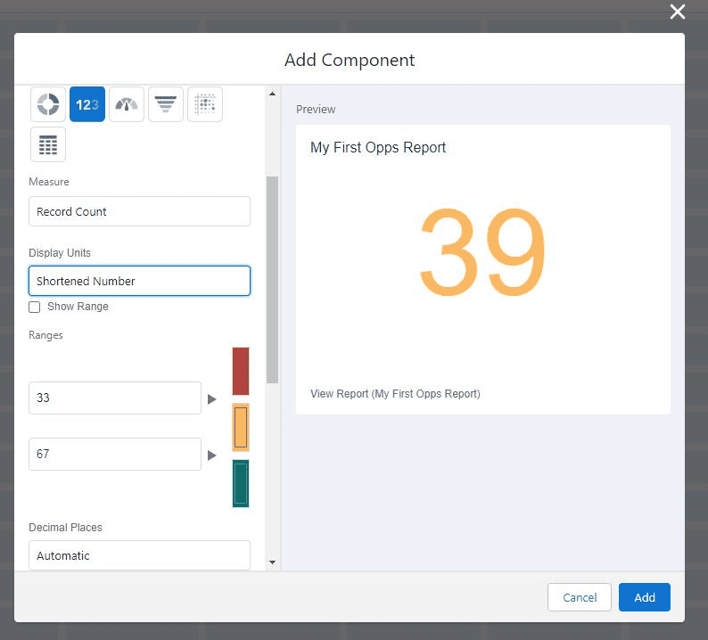
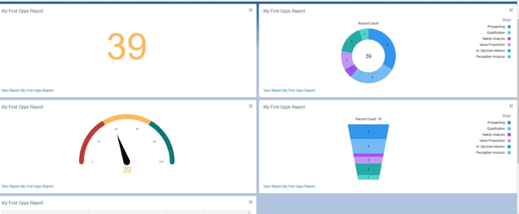
Metric Chart
The simplest component is the Metric Chart which simply gives a numerical read out of a field that you select. On this dashboard, I want to use it to calculate the overall number of opportunities.
When you use a Metric Chart, you can set ranges where the number will change color to indicate whether the number is good or bad.
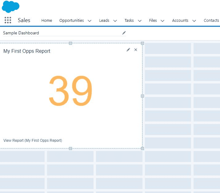
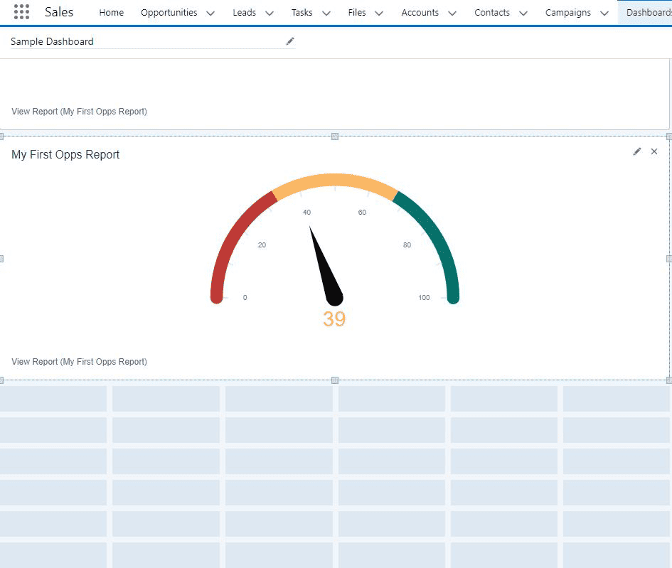
This component, like others, can be dragged with your mouse cursor which changes the shape, size, and location of the component on the Dashboard canvas.
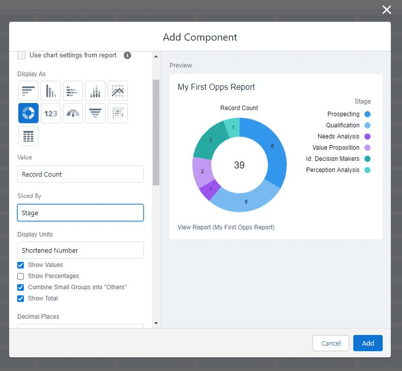
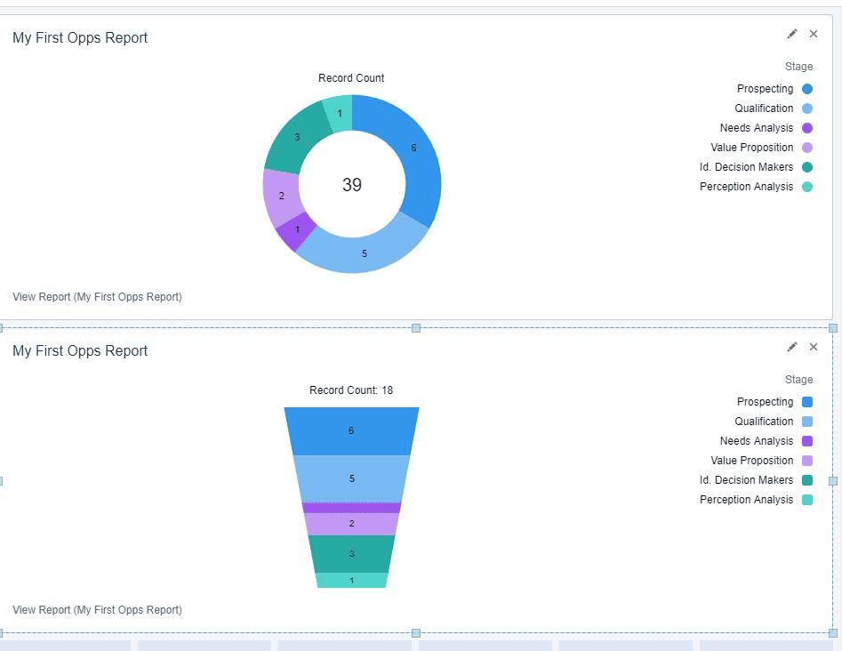
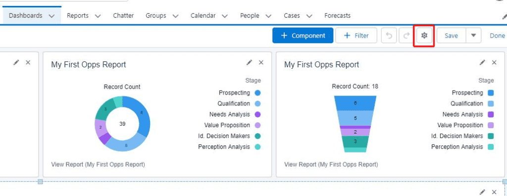
Donut Chart
The Donut Chart is a great way to get the overall total of a certain value, as well as break down sub-totals within that value.
It is for counting the number of records of certain accounts, or the number of opportunities at each stage.
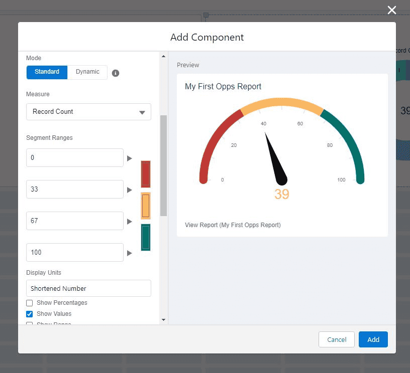
Gauge Chart
The gauge chart is similar to the metric chart in that it gives you an overall value, but it nests the value on a gauge that looks like a speedometer, and you can set the range for the chart making it easier for the user to see where the value is, against the desired range, and adjust the color of the number accordingly.
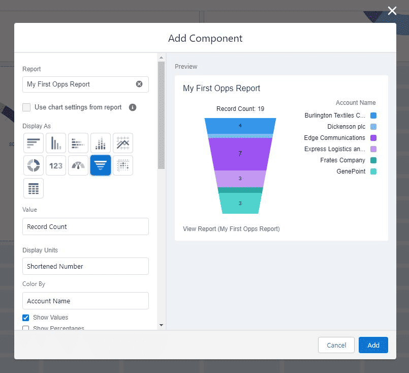
Funnel Chart
The funnel chart is ideally suited to show how many records are situated at different stages of a process.
Opportunity stages are displayed well with a funnel chart.
Lightning Table
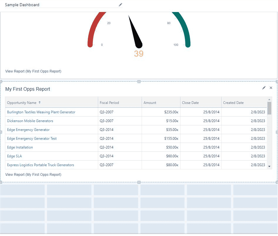
The final component I will add to my sample Dashboard is a Lightning Table. Lightning tables allow you to insert a list of associated records, similar to a report.
Rearranging A Salesforce Dashboard
I am not satisfied with the components on the Dashboard, it is too large, and too much scrolling is required to see the information.
To see more of the dashboard on a single screen, I will select each component, resize it, and rearrange it to get the four charts to fit along the top of the screen with the Lightning Table underneath, the full width of the screen.
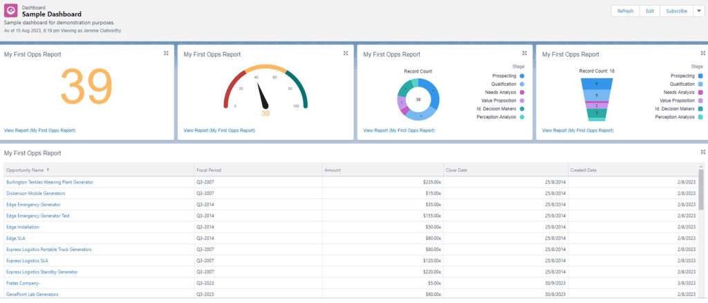
This is one of my personal favorite dashboard layouts because of how efficiently you can capture a range of different data points and insights.
Change The Dashboard Data View
Typically Salesforce Dashboards will give you a visual view of the records the Dashboard creator has access to see. But it is possible to change this.
To change what data is displayed on a Dashboard, with your Dashboard in ‘edit’ mode select the gear icon.
If you select Me, it will show data based on the record visibility of the Dashboard creator (you).
If you select Another Person, the Dashboard will display data based on the record visibility of the Salesforce user that you select.
If you select The Dashboard Viewer then a single Dashboard will change and display data based on the specific user that is looking at the Dashboard.
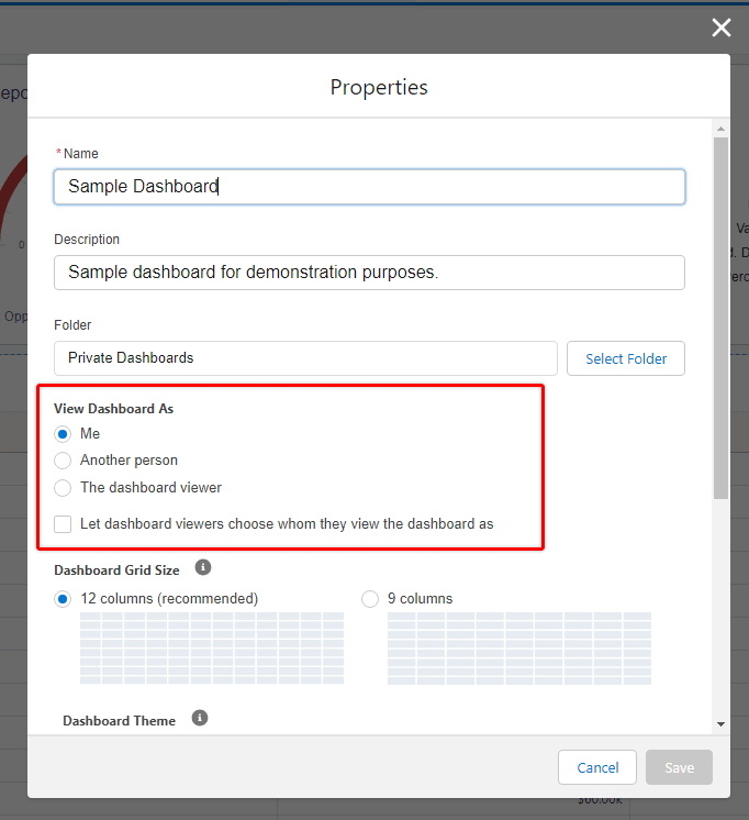
These are referred to as Dynamic Dashboards. These a very popular in Salesforce Orgs given their flexibility.
There is a limit to how many ‘Dynamic Dashboards’ an Org can have – depending on the license type of your Salesforce Org, but it is possible to purchase extra dynamic Dashboards if you want or need them.
Sharing a Dashboard With Other Users
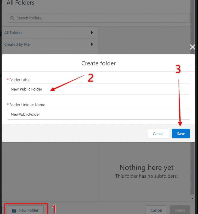
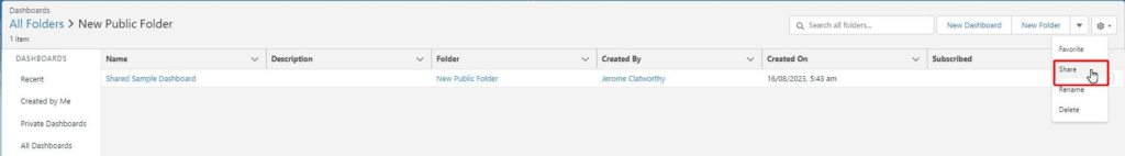
The way that you share a Salesforce Dashboard with other users, is by saving the dashboard into a Public Folder.
Once the Dashboard is saved in a public folder, you need to ensure that the people who need access to that dashboard, have access to that Salesforce folder.
There are a variety of different permissions that can be given to people to administer who can see dashboard folders, and what they can do with them. This Salesforce Help article explains the different permissions well.
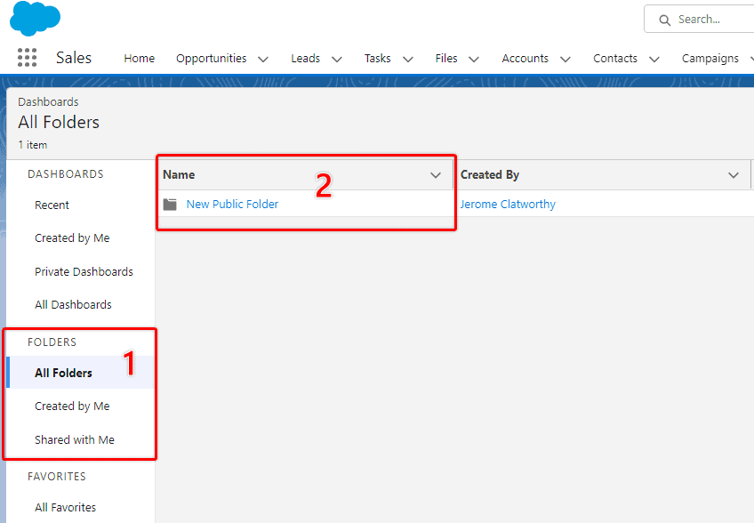
With the relevant Dashboard folder open click on the down-pointing arrow and click ‘Share’.
You can share a Salesforce Dashboard Folder with particular users, users with certain roles, users with roles, and public groups (if they have been set up).
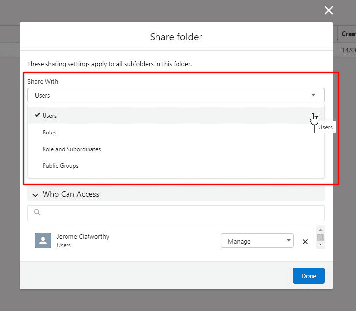
For each person, role, or group that you share the folder with, you also indicate whether they can view/edit or manage the folder as well.
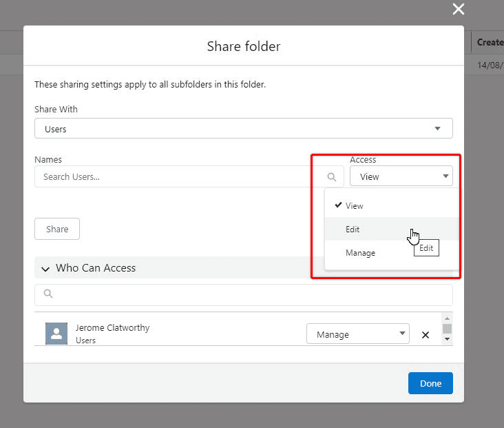
The users, roles, and groups that you set up, will now be able to access the dashboards that are saved in with the type of access that was granted. You can edit and update the sharing settings at any time.